


/_Cropped%20Version/_Cropped%20SVGs/ZayZoon%20Logo-FC-Cropped-Slate%20text.svg)
/_Cropped%20Version/_Cropped%20SVGs/ZayZoon%20Logo-FC-Cropped-white%20text.svg)
.png?width=300&name=Untitled%20design%20(1).png)
.jpg)
It’s not often that you get a chance to see a brand grow from its infancy. It’s even rarer to get to work on building it and then rebuilding it as it grows beyond what you’d initially imagined possible. This is the story of how we’ve managed to do both at ZayZoon.
Today, we’re so proud to announce the new look and feel of ZayZoon. A Jonathan Van Ness level of transformation that has helped us shed our layers and reveal the shiny unicorn that we already knew was inside.
Since 2014, ZayZoon has been on a mission to empower employees in their financial journey through accessible products. Today, we’re reimagining what our brand looks like, staying true to our core values of trust, mastery, hustle, and being people driven. This new integrated look reflects the pace of our evolution and will help us to continue to deliver on the promise that ZayZoon is for everyone, wherever they are on their journey.
Let’s dive in.
ZayZoon origins: How it started
When I first joined ZayZoon in 2020, I was employee number 23. We worked with 896 businesses and had a partnership with 50 payroll providers. Back then, marketing was an on-the-side-of-your-desk gig, spearheaded by our founder, Tate Hackert, and supported by our VP of Growth, Shubh Sidhu. I’d worked previously with other small businesses to build their brand from the ground up, focusing on purpose and making sure marketing efforts reflected it, and ZayZoon was just at that point to take its first baby branding steps.
One thing was clear: the brand, our mission and our values were at the core of everything that we did, and marketing was no exception. Whenever I was uncertain if a design or marketing asset was on brand, all I needed to do was ask Tate, and it always felt like asking the brand personified.
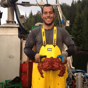
ZayZoon founder, Tate Hackert lent money through Kijiji and Craigslist to help employees
with cashflow between paychecks, after working on a commercial fishing rig.
Through the years, Tate had lived through the process of not just building this business, but answering and helping our customers directly. Tate has done a stint at almost every single role in this company and knows how it all works. It was an experience unlike any other brand I’d worked with before.
As we grew, so did our branding. As the first full-time marketing employee, I worked to expand our visual assets and help define our messaging. Every step we took was towards defining our identity and growing together, always with our mission to improve employee financial wellness at our core.
At that point we had grown into a team of three. Chaz Somers had been there from the beginning and had an incredible pulse on what was ‘right’ for us and what felt off. Casey Woods came in to solve all of our digital qualms and propel us into another dimension. We kept growing. It was amazing.
Then Victor Platon came in as our first product designer and he turned things up a notch. Victor helped define and expand our brand, brought it to product in a way we couldn’t have before, and helped introduce us to elements like being Web Content Accessibility Guidelines (WCAG) compliant, defining our own color scheme, and implementing that throughout all of our assets. We asked ourselves questions like: “If we need an alert, what does a ZayZoon red look like?” It was so exciting.
Victor Platon came in and expanded the ZayZoon color palette to fit all of our marketing and product needs.
In 2023, we have 86 employees, the marketing team has grown from three to 12 amazing people, we work with 4,517 businesses, and have a partnership with 155 payroll companies. We’ve managed to grow this rocket ship while staying true to our mission, and maintaining high customer and employee satisfaction, with an NPS of 70, and an eNPS of 77.
With this level of growth, it’s no surprise that we had outgrown our brand elements – it was time to show the world what we already knew was there.
In comes the brand refresh.
The big brand refresh: How we did it
Picture it, it’s December of 2022 and we start to casually talk about refreshing our identity. What about graphics? What do we think about stock imagery? How can we be more consistent?
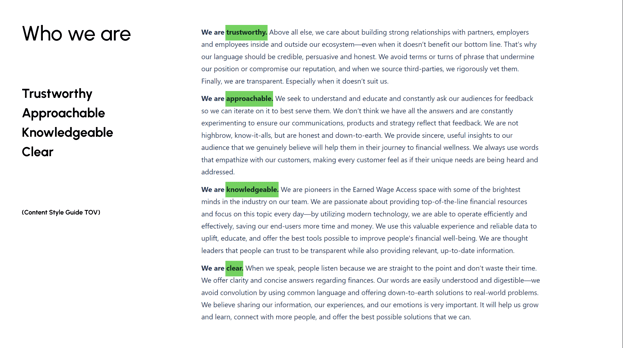
As believers of working from the inside out, we wanted to make sure we focused on doing everything based on our purpose. We went to our content style guide, reviewed the key words we had flagged as defining us, our North Star. This helped shape every aspect of our new brand look and feel.
Let’s break down the main aspects of our brand, shall we?
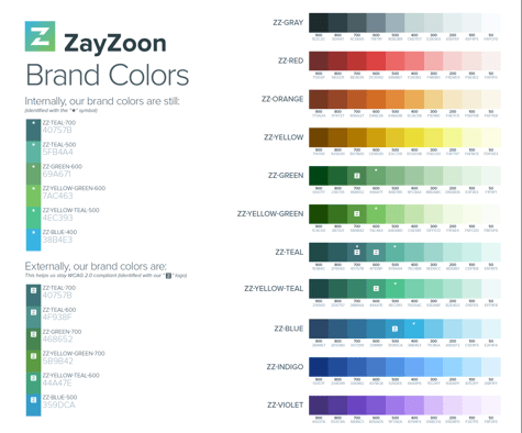
Our colors:
A snippet from ZayZoon’s content style guide
When looking at these adjectives through the lens of color psychology, we found that we encompassed them already in our current branding, with blues, greens, and teals all falling within that spectrum: our core colors.
Our brand expanded beyond a gradient and into a whole Zay-universe.
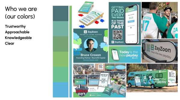
Through the years, we’re proud to say that we’ve taken that blue-green spectrum and gone wide and deep to build a brand that is true to who we are and recognizable. From showing up at payroll conferences, to taking an RV trip across America to connect with our audiences, the ZayZoon brand has expanded and established itself, always embodying the concepts of being trustworthy, approachable, knowledgeable, and clear.
Yet when we dove deeper into our content style guide, we could see that we are more than those basic concepts, and we needed to bridge that gap.
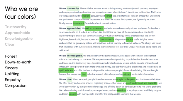
A snippet of our content style guide. Our representative adjectives are highlighted.
To truly represent who we are, we needed a wider gamut of colors to represent honesty, sincerity, empathy, and compassion, to name a few.
Accessibility was one of the key factors we wanted to make sure we took into account, and the blue-green palette often failed at being WCAG compliant.
So, we expanded it.
Our brand colors exxpanded to give our brand the dynamism we represent.
We started with our core colors, blueish green and teal, staying true to who we are. Then, we added warmer colors that will help us create visual assets that match our tone of voice. With these, we’re able to tell a fuller story, always being grounded in our legacy brand colors. Next, we added neutrals for things like typography and skin tones. Finally, we expanded this color palette to give us a full range of tints and shades to use.
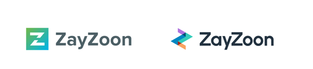
Our logo:
Our next order of business was our logo. Because our logo is so closely tied to our colors, many of the same design pitfalls applied to it. We had expanded it over the years to have a vertical alignment, but it was time to evolve.
So, Victor went back to the sketch board and started playing with some options.
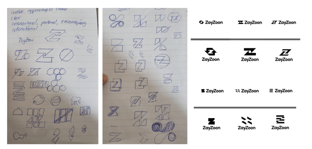
Victor Platon went to the drawing board to invent our new logo.
Always based on our content style guide, he played around with our name, the iconic ‘Z’, and the main idea of our interactions with our various audiences.
Thus, a logo was born.
Victor Platon came in and expanded the ZayZoon color palette to fit all of our marketing and product needs.
Let’s break it down.
First let's start with colors. This refreshed logo brings along with it the new color palette. The legacy colors are front and center, the core of who we are. Our bluish green and teal, showing we are knowledgeable and trustworthy.
Our new warmer colors complement them, and when seen together can start to tell a story without saying a word – like "a full suite of Financial Wellness features" or "the whole is greater than the sum of its parts" It helps to showcase that ZayZoon is compassionate and has empathy. It also tells the story that we are there for our customers, no matter where they may need us on their financial journey.
.png?width=400&height=400&name=LinkedinTwitter%20DP%20(400%20x%20400).png) The ZayZoon icon.
The ZayZoon icon.
Structurally, two arrowheads are the main shapes. They represent our connection to payroll and to the employee. That connection is the basis of trust. And with that transparent treatment we are saying we are clear, honest and sincere.
Our fonts:
The next layer was revamping how our words look and feel.
We’ve been using Proxima Nova as a main font, defaulting to Open Sans wherever it wasn’t available. Open Sans is a Google Font, which means anyone can use it and is the main font we use in our app. The downside of it is it's used as a default font by many companies and has a limited range of thicknesses.
Proxima Nova has a wider range of thicknesses which is important to establish visual hierarchy in our marketing materials. On the downside, though, the font has to be downloaded via Adobe if you want to use it on any design platform. This is a blocker for our people on the marketing team.
Best practice dictates that we should be using fonts consistently on our app, website, and all marketing materials.
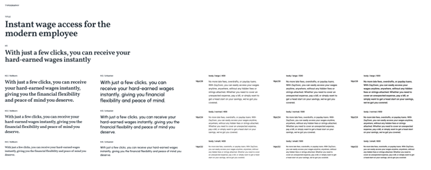
In comes Urbanist. Urbanist is a variable font with a wider range of thicknesses than our old fonts. It's also a Google font, meaning anyone on the team can use it. Perfect for marketing. It’s also a very modern looking font that has a wider, more stable stance, and as a result is easier to read in print and in digital format.
Urbanist is a dynamic font that allows for a wide range of thicknesses.
A good example of the structural components in Urbanist is the lowercase "a". Our old fonts have a two-story lowercase “a”, with an aperture above, and the bowl below. Urbanist uses a one-story lowercase “a”, with just the bowl. This is important because when you look at our new ZayZoon logo with Urbanist as the font, you see the rhythm of the geometric circles as they go from "a" to the double "o". The echoes of the circle are there. The word ZayZoon looks cleaner. It looks intentionally designed. Lastly, the one story "a" is typically how people write the lowercase "a" bringing us closer to the human adjectives of empathy and compassion.
The traditional ZayZoon logo stands next to its new iteration.
Yet, Urbanist can’t do all the heavy lifting alone. It needs companions. Which is why we’re introducing Vollkhorn and Inter to create an all-encompassing font harmony that showcases our diversity and puts accessibility at the heart of our words.
Like the wider color gamut we talked about earlier, a serif and sans serif pairing gives us a wider range of voice when it comes to words on the screen. Serif fonts lend us credibility, stability and a human touch. Sans serif fonts show that we are modern and precise. When you look at them together, the visual variety is similar to a steak and wine pairing. Different, but complementary.
The whole set of typographies that compose the ZayZoon brand.
Our visual line
Now that we had all the basic elements of a brand, we had to expand on it through a visual line. This includes our use of illustrations, photography, icons, graphic and background elements, and more.
This is one element that we hadn’t defined previously. As a small but mighty team, we had a general grasp of what look and feel we were usually going for. Yet as our team grew and our brand grew with it, it became essential to define.
Some of the elements that were key in this implementation were being people-centered, incorporating movement into our shapes, and having supporting graphical elements that made everything match.
Let’s check them out.
People first:
At ZayZoon, everything we do is for our people. Be it our audiences, the businesses we partner with, or our own team, it is essential to our every move. It was only natural that we put people first in our visual line, showcasing the amazing variety of ethnicities, ages, abilities, and roles that we serve.
We use photography to represent real people in real scenarios. After all, we’re that friend they go to to talk about their financial journey, so it is essential that we see them as they truly are.
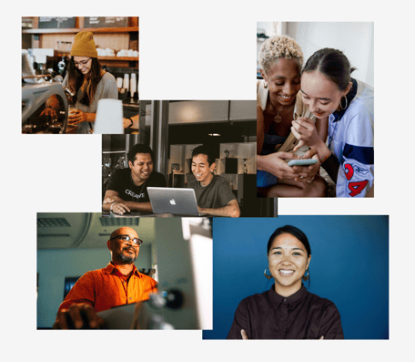
People are at the core of everything we do.
Movement
Our logo, the core of our brand represents movement and dynamism, so we broke it down and developed elements that reflect that in various ways through background imagery, textures, and color.
It went something like this:
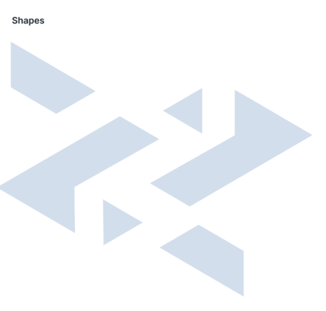
Our brand assets grow together to create an experience.
Supporting graphics:
Iconography and UI screens are the cherry on top of the branding sundae. One thing about financial products is they are often complicated to explain. When you’re in an industry that’s revolutionizing the way people are paid, it can get even tougher to get the message across in a way that is simple and accessible to all. This is why we have simplified graphics that help support our main elements.
First, we start with a series of line icons that support concepts like how we bring value to the businesses that partner with us, or how we ensure that our security is top notch. These are simplified concepts, overlaid on a transparent element that is also broken down from our initial logo elements (triangle shapes, circles, elements that represent movement and dynamism). The transparency treatment in them showcases that we are clear and honest.
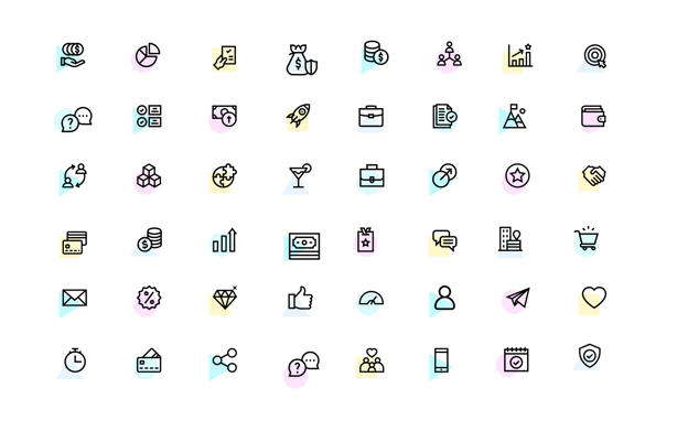
Iconography with a transparent treatment supports our graphic line.,
Next, we have simplified UI screens that elaborate on the different functions that are available throughout our platform. These showcase moments like when an employee can check on their available wages, or elements of our financial education platform, where people can look at their expense trends or follow up on their financial courses and what’s next.
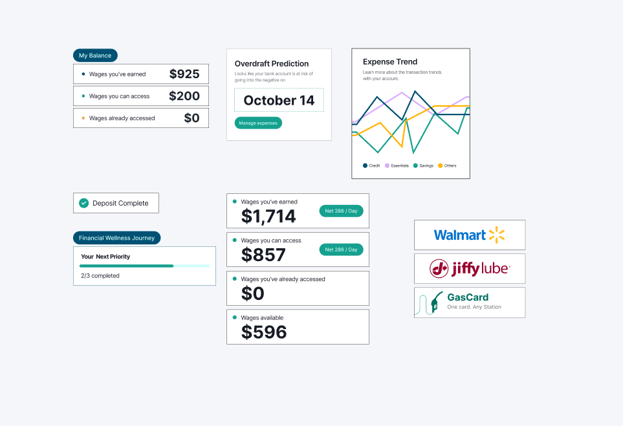
Snippets of the ZayZoon experience showcase the different features of our product.
Our message:
Branding doesn't just involve visual assets, like a logo, color palette, etc. It also concerns messaging. So while we were chipping away at our visual identity, we were also tackling messaging. Tyler Munro (our Director of Content Marketing) and Emmi Banner (our amazing Product Marketing Manager) did a deep dive into terminology, (what do we call our products? what do we call ourselves?) and optimizing that verbiage across all of our assets so we move into this new era stronger than ever before.
Shannon Dougall, our fearless leader, also spearheaded the effort to reinvent our website and optimize the flow of information to best cater to our audiences. There were mind maps, brainstorming sessions. It was beautiful to see.
Customer care:
Our business started with Customer Care, putting those conversations we have with the people that use our products at the forefront of everything we do. This is why it was the perfect time for a little in-house rebrand of one of our most important teams.
With the new rebrand of ZayZoon, our Customer Success team is changing their team name to Customer Care. At ZayZoon, Customer Care is the process of helping build emotional connections with customers and employers and we strive to do that every day. Terms like “support” or “service” lean more towards a transactional interaction, which is not what our team is about. Our Customer Care team is passionate about going above and beyond for our customers, while also building an emotional connection. We are accessible, approachable and credible, while also taking time to be thorough with each customer.
A new era for ZayZoon
Now that all the individual elements have been updated, it is time to start releasing them into the world. This brand refresh is not about us following the latest, shiny design trends, it is about being true to our core values, and showcasing that authentically to the people we serve. We’ve worked hard to deliver a brand identity that speaks to our audiences.
This new brand look and feel will continue to grow with us and iterate as we continue to do the same. The work is never over, but we’re just so glad you’re here along for the ride.
Welcome to the new ZayZoon.
.jpg?width=290&name=SusyA-Photo%20(1).jpg)